Hey, Micaela here!
Designer, creative, and adventure-fueled entrepreneur helping bold businesses build brands and websites that actually work.
blog topics
Branding
Web Design
Marketing
Remote Work
freebie!
The Ultimate Website Prep Checklist
A guided checklist built to prepare both DIY template users and those ready for a custom website build with a designer.
connect with me
8 Reasons I Build All My Websites on Showit (and Why You’ll Love It Too)
SHARE POST

In the crowded world of website platforms, Showit rises above the rest — built for those who want creative freedom without losing sight of strategy and results.
That’s why I design all my sites on Showit, the drag-and-drop website platform that gives coaches, service-based entrepreneurs, and creative business owners (like you!🙂) the freedom to design and manage their own site with confidence and build a website that actually grows with their business.
Before I discovered Showit, I explored a few other website platforms, but none of them offered what I was looking for. Most felt too limiting creatively or too technical to give clients true independence once their site was live. I wanted something that gave me full creative control as a designer but was also easy for my clients to update on their own, and Showit checked every box! 🙌
From the moment I started using it, everything just clicked. It offered the perfect balance of creativity, ease, and strategy, both for me as a designer and for my clients after launch. 🎉
Here’s why Showit is still my go-to platform (and the only one I use for every design project):
1. Total Creative Freedom
Showit gives you complete control over your website design. Every layout, layer, and pixel is yours to play with!👩🏼💻 You can move, resize, and customize anything you want without being limited by rigid sections or preset layouts. And the best part? You can do it all without touching a single line of code!😍
Everything you need to create a custom, strategic design is already built right into the platform. Whether you’re starting from scratch or using a Showit template as your foundation, you have the flexibility to make it completely your own.
For designers, that kind of freedom is a dream come true. And for business owners, it means your website can finally look and feel exactly the way you’ve always wanted. No coding required, no developer needed. It’s where your creativity and personality take the lead, giving your brand an online home that feels like you!✨
2. Drag-and-Drop Simplicity
Think of Showit as the Canva of web design, only way more powerful.😮💨 You don’t need to know code, plugins, or developer language to create something beautiful. If you can drag and drop, you can design in Showit (it’s that easy!).💁🏼♀️
Once you’ve added your brand colors, uploaded your fonts, and dropped in your logo, your site instantly starts to take shape inside the builder. Want to move a photo? Just click and drag it. Need to tweak spacing, swap out colors, or adjust a layout? It’s all right there in front of you with a visual editor that lets you see your changes in real time as you work — and the best part is, you can play around freely knowing nothing is permanent until you’re ready to publish.
It’s intuitive enough for non-designers but sophisticated enough for professionals who want more control over their layouts. You can experiment, tweak, and build confidently without ever worrying about breaking something or losing your progress!🤩

3. Built for Beautiful Mobile Design
This is one of the biggest reasons I fell in love with Showit. Most platforms let you preview what your site will look like on mobile, but you can’t actually change the layout itself. Platforms like Squarespace automatically adjust your desktop design for mobile, giving you very little control over how things stack, resize, or appear.
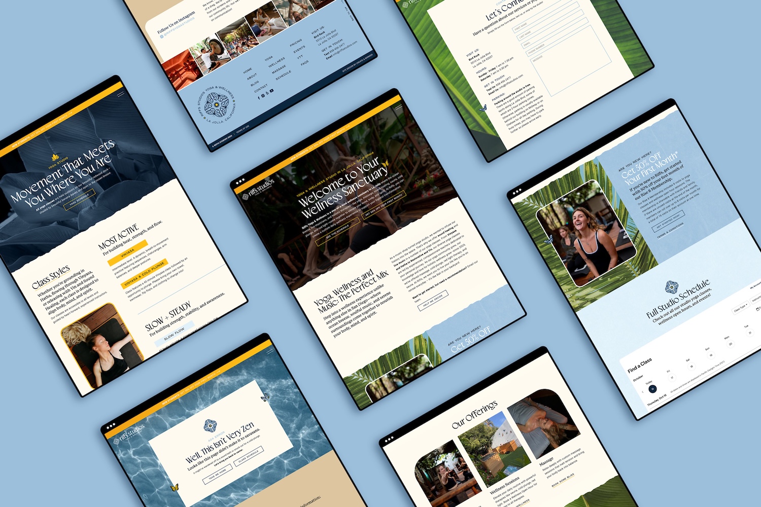
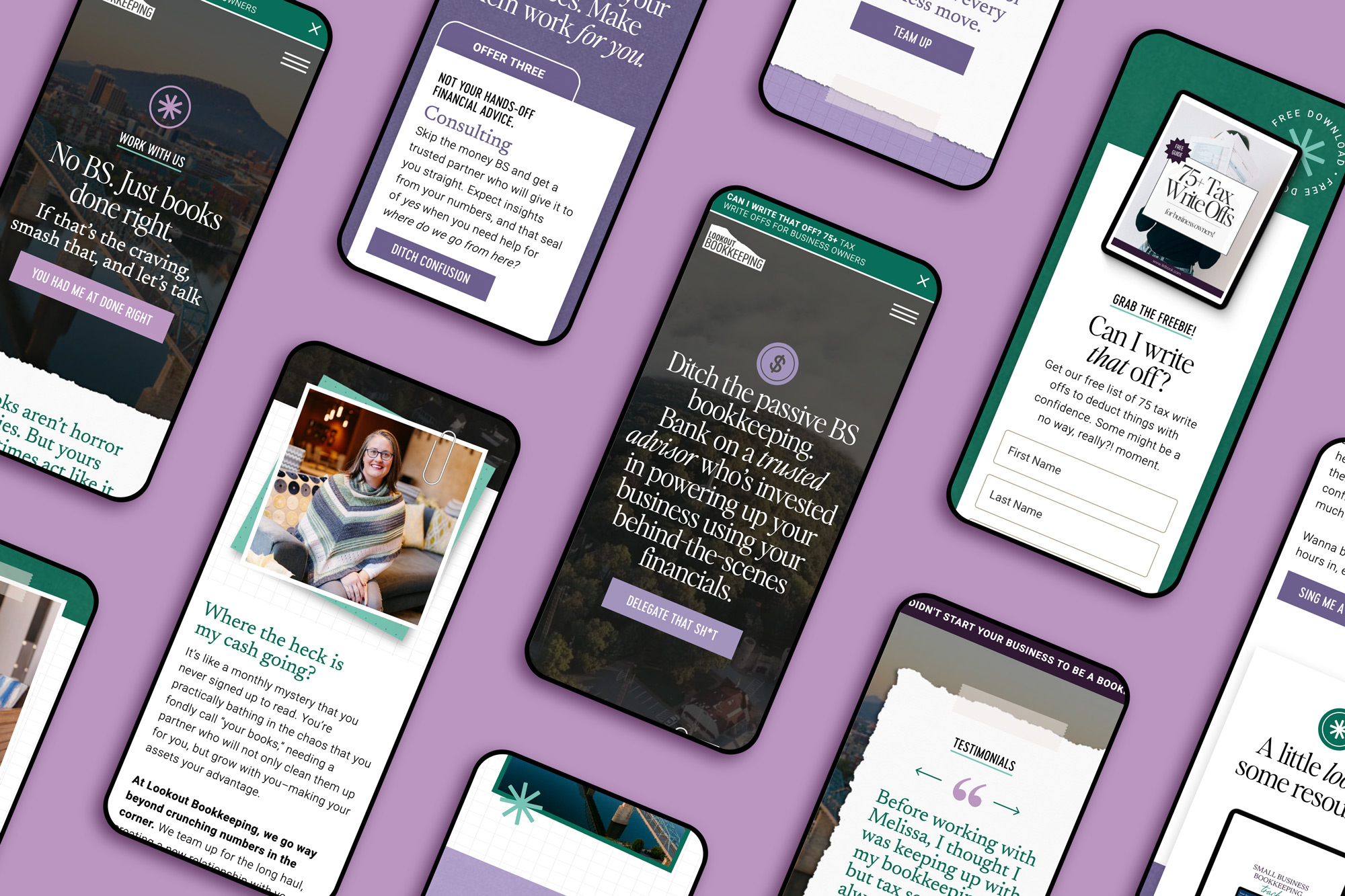
With Showit, you can completely tailor your mobile layout separately from your desktop design, which means your site looks just as good in someone’s hand as it does on their laptop. You can move, resize, or even hide elements specifically for mobile to create a seamless browsing experience that still feels intentional and on-brand. Want your layout to stack differently or your images to fill more space? Easy. Want a cleaner version of your site for mobile visitors who are just scrolling on the go? Totally doable.
Since most website traffic comes from phones these days, this feature is a total game-changer.📱 It’s one of those details that makes a huge difference for your user experience and one of the many reasons I’ll never use anything else.
4. SEO That Doesn’t Feel Overwhelming
SEO can be intimidating, but Showit makes it refreshingly simple. Each page has clear fields for titles, meta descriptions, and image alt text so you can optimize as you go without needing complicated settings or extra plug-ins. You can handle the essentials right inside the platform while you’re designing, so it never feels like an extra step.
And if blogging is part of your strategy, Showit connects directly with WordPress (more on this below!), which means you can access SEO tools like Yoast to fine-tune your blog posts for search. It’s truly the best of both worlds, you get the creative flexibility of Showit paired with the powerful search capabilities of WordPress.
What I love most is that SEO doesn’t feel like an afterthought here. You can design something that looks amazing and still works hard behind the scenes to help new clients find you online.
5. Seamless WordPress Integration for Blogging
Speaking of blogging, this integration is one of my favorite Showit features! The two platforms work together beautifully, bringing together the strengths of both systems in one seamless experience. You can design your blog visually in Showit, including your header, footer, post layout, and sidebar, while your actual blog content is powered by WordPress behind the scenes.
This means your blog keeps all the power, structure, and SEO benefits of WordPress, but you still get full creative control over how it looks and feels. No cookie-cutter blog themes, no clunky formatting, just a custom, visually stunning blog that perfectly matches the rest of your website.
For business owners who blog consistently, this setup makes everything so much easier. You can write and publish posts in WordPress as usual, and your blog will automatically display inside your custom Showit design. It’s a win-win for anyone looking to grow their traffic organically.
6. Effortless Third-Party Embeds
Showit plays well with others, which makes it incredibly easy to connect the tools your business already runs on. You can embed forms, checkouts, schedulers, or email sign-ups right onto your pages with a simple snippet of code, no complicated integrations or developer needed.
I’ve used this flexibility for clients to embed everything from Dubsado forms and Flodesk opt-ins to Shopify Starter product pages and Thrivecart checkouts. It’s perfect for service-based businesses that want their favorite tools to work seamlessly within their website design.
And for more advanced features, like course platforms or membership sites, Showit can still connect through WordPress to keep everything running smoothly behind the scenes. It’s flexible, functional, and designed to grow right alongside your business.
7. Support That Feels Like a Team
Showit’s support team is unmatched! 🎉 They’re quick to respond, genuinely friendly, and truly care about helping you troubleshoot (which feels rare these days). Whether you’re dealing with a tech hiccup or just need help figuring something out, they’ll walk you through it step by step until it’s solved.
On top of that, there’s an amazing Showit community online, especially in the Facebook user group where designers and business owners help each other out daily. And if you prefer figuring things out on your own, Showit’s help docs are seriously top-notch — easy to follow, visual, and super detailed. You’re never left hanging when learning or launching on this platform, which is one of the biggest reasons I recommend it to all my clients!
8. Easy for Clients to Edit + Manage
At the end of the day, that’s what makes Showit so special! It’s not just built for designers, it’s built for you! My biggest goal with every project is to make sure clients feel confident running their site after launch, and Showit makes that simple.
The backend is clean, visual, and straightforward. No confusing plugins or code, just an intuitive builder that makes updates easy. You can swap photos, update text, or even tweak layouts without stress or fear of breaking something.
That kind of independence is what I love most about this platform. It gives my clients the freedom to actually use and update their website regularly instead of feeling stuck or overwhelmed by it, and that’s what makes Showit a total game changer.
Showit isn’t just another website platform.
It’s a creative tool that gives business owners the power to build and manage beautiful, strategic websites with ease.
Whether you’re DIYing your site from a Showit template, working with a designer for a template customization, or ready for a fully custom Showit website, you’re building on a platform designed to grow with you.
It’s the same platform I trust for every client project — and it’s what I use for my own business too! It’s flexible, empowering, and built for bold business owners who want a site that actually works for them.
👉🏻 If you’re ready to see what’s possible with Showit, explore my Showit template shop, learn more about template customization, or dive into my custom brand and website design services.
Disclaimer: Some of the links on this page are affiliate links, which means I may earn a small commission if you choose to make a purchase. I only recommend tools I genuinely use, love, and trust to support your business.
Join the Newsletter
Navigate
Home
About
Portfolio
Template Shop
Services
Branding
Branding + Custom Website
Template Customization
Design Intensive
Learn
Resources
Blog
Connect
Contact
© CREATE & WANDER 2025
BUILDING BOLD BRANDS + SHOWIT WEBSITES FOR COACHES AND ENTREPRENEURS IN CALIFORNIA AND BEYOND!
PRIVACY POLICY
TERMS & CONDITIONS
DESIGN SERVICES
Bold design for every stage of business.
A visual identity that actually feels like you: bold, cohesive, and made to stand out. This experience is all about creating a strong foundation for how your brand shows up online and off.
This full brand and website experience is completely custom and built from the ground up. Perfect for businesses that are growing, pivoting, or stepping into their next level with bold, strategic design.
Love one of the templates but want it to feel more like you? I’ll customize the layout, integrate your brand visuals, and tailor the design so it looks and feels fully custom, without the full custom timeline or price tag!
Already have your brand in place and just need support? Design Intensives are perfect for website updates, social graphics, or one-off projects that need to get done quickly and without the fluff.